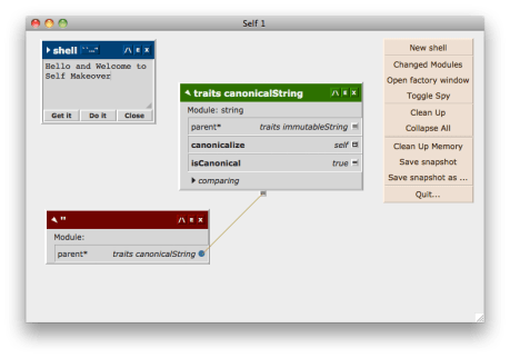
Self’s Morphic interface actually has a lot of charm, but unfortunatly it is in a early NeXT fashion. Lots of grey. Or is that gray? One of the things which scratches an itch for me is cleaning up the interface to make it more comfortable to use.
Adventurous people can download a snapshot which shows the current thinking. Not much has changed, but font styles and sizes have been altered and some colour brought in:
The guiding principles for this makeover, which come from the idea of Self itself, is the creative intersection between minimalism and humanism.
More will be coming – why not join us for the ride?

The new colorful menu and fonts looks good.
Dierect operation in morphic interface is a great idea,but the current UI paradise is base on the mouse and key board.Many new UI devices and design such as:touch pad/screen,stylus,layered and transparent interface should be introduced into Self’s UI.
In fact,The functions used by these new features is already supported in the Self env,but they were not designed into the UI.
I think there shold be an absolute redesign in the UI of Morphic interface.
I think the ideas in “The Humane Interface” written by Jef Raskin is helpful.
Hello Russel, nice work !
Having colors and not using them for semantic distinction seems a waste to me.
How about (I like your colors shades):
Traits: blue
Prototypes: green
Shells: yellow
Debuggers: red
Slices of Selectors: orange
Slices of Implementors: lightblue ???
Thomas
What font are you using? Except for the welcome message I don’t get any text. All the boxes are empty, but the buttons are working.
I’m testing on a Debian and on a Xubuntu box.
Hi Diego,
The screenshot is from a Mac, with Verdana. There are problems with automatically finding a replacement font on Linux as there doesn’t appear to be a standard equivalent guaranteed to be available on all distros (I originally tested on Ubuntu only), but I’m working on a more sophisticated fallback mechanism.